Data for each of the topics and their subtopics comes from publicly available sources. This includes national data from the U.S. Centers for Disease Control and Prevention (CDC), as well as regional and local data from health departments, agencies, and jurisdictions.
You can find a link to data sources below each of the data dashboards.
Data Gaps and Limitations
There is value in working with data gaps. Public health professionals can compare data for their jurisdiction with others to see where gaps in their jurisdiction’s data may exist. Seeing gaps in existing data provides jurisdictions with opportunities to think more inclusively about their data collection and definitions. It also helps better understand the bounds in which findings from the data can be applied.
There are several reasons why data gaps and limitations exist. One of the main reasons is that data collection is not standardized across jurisdictions and/or state lines. For example, some data collectors may lump multiple racial and/or ethnic groups together (such as combining American Indian, Alaska Native, Native Hawaiian, and Pacific Islander) or not collect more detailed information (such as giving options for Native Americans to indicate their tribal associations). Additionally, gender data may be defined as only male or female, meaning people who identify as other genders (such as non-binary, gender fluid, agender) would not be included or properly identified in the dataset.
Another reason there could be gaps is that nationally-collected data is often collected less frequently or less extensively in rural jurisdictions compared to urban ones. This can lead to data being suppressed or not available at all.
It is also important to consider that data does not often include policy mechanisms and institutional factors that cause disparities. Demographic data is often used as a proxy for those factors, although you should keep in mind that disparities are not inherent to the individuals or groups experiencing them. Demographic characteristics are not the cause of the disparities; policy mechanisms and institutional factors are.
We suggest that people look carefully and critically at what data is available by looking at how data is defined. Seeing what data is not available (such as data for genders that are not male or female) can tell you that there might be gaps in the data, which can unintentionally hide disparities.
Caution With Comparing Numbers
Numbers refer to direct, raw counts that result in a total quantity whereas rates are calculated based on population. Within each subtopic there will be indicators you can select that will note if the data is provided as numbers, rates, or another measure.
When comparing public health data, it is important to consider different population sizes. For this reason, it is best to use rates — such as per capita. Comparing numbers when the population is unknown is discouraged because the data is only highlighting the difference in population and will not allow for meaningful comparisons between jurisdictions beyond population size.
If only numbers and not rates are available over a length of time for a single jurisdiction and there are not significant changes in the population during that time period, numbers can be compared within that jurisdiction. Even though numbers are not necessarily best for comparisons, rural practitioners have told us they still have value. Therefore, we want to provide these data even if rates are not available or have not been calculated yet.
You can learn more about rates from the Washington State Department of Health.
Defining Rural
Using the U.S. Census Bureau and the Office of Management and Budget’s definitions, we designate a county as rural if it is a micropolitan statistical area (has at least one urban cluster with 10,000 to 50,000 people) or a non-core based statistical area (has fewer than 10,000 people and no urban cluster).
While some counties and jurisdictions are not rural by the definition above, they are also not urban, so we have divided data on this site by rural and not rural.
Dashboard Tips and Frequently Asked Questions
Find answers to using the data dashboards. If you still have questions, please feel free to contact us.
If you aren’t sure where to start, we recommend you begin with data and health equity trainings. These trainings will help you better understand and articulate health equity, identify health disparities using data, and create presentations using data to communicate with decision makers in your community for addressing health inequities. These tasks and steps can be essential to gathering support for your data-driven decisions and moving your efforts forward within your organization and/or community.
For help with using the dashboards in practice, see our 5-minute demo video to give you some ideas, or see our 15-minute demo video which is a comprehensive introduction to the website.
For help on getting started with interpreting data on the dashboards, see our quick start guide.
You can also explore the data dashboards to help you identify a topic or specific issue based on your community’s needs. We hope the data will help guide your focus and be a key aspect of the decision-making process. Then, you can search the training resources here for what is most relevant to the issue, or issues, you want to address.
Hover your mouse over the graph to see details about certain data points and get more information. Continue hovering around the graph to learn more about its features.
If you are looking for data sources, those can be found below the dashboard by clicking the button labeled “View Data Sources.”
You can select and display “rural” or “not rural” data by clicking on the color legend.
In the state drop-down menu, uncheck “All” and then check the box for your state.
In the Jurisdiction drop-down menu, first uncheck “All,” then type the name of your jurisdiction in the search box at the top of the menu. Check the box for your jurisdiction to display the data. This can be repeated to display data for multiple jurisdictions.
Hover over the data you want to hide (in this case the state count) and a pop-up section will appear with more details about the data. Click on the state data and an option to “Keep only” or “Exclude” appears at the top of the pop-up. Click “Exclude” to hide the data.
Hover over the axis labels at the bottom of the dashboard to reveal a tiny sort icon: ![]() .
.
Click this icon to sort the data from high to low numbers, and click again to sort from low to high. Please note that data is sorted by region.
Once you have the dashboard displaying the data you want to see, click the “View and Download Data” button above the dashboard. This will display the data in a table. Click the “Download all rows as a text file” link at the top of the table to save the data as a CSV file. Sometimes you will need to click on a visualization before the data will be available to download as a CSV file. In this case, you will need to click on a data point in the visualization and then click somewhere outside the data point. When you click on the “View and Download Data” button, the data should appear and then you can download it.
Once you have the dashboard displaying the data the way you want, click the “Export Image” button above the dashboard. Then, click “Download” in the dialog box that appears. Your image will be saved as a PNG file.
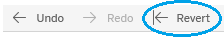
After making changes to the data display, you can start over by clicking the “Revert” icon in the lower left corner of the dashboard.
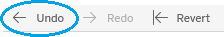
These and most other dashboard actions can be reversed by clicking the “Undo” icon in the lower left corner of the dashboard.