This website offers a collection of curated, free trainings and webinars from public health organizations across the U.S. The SHARE-NW team selected and evaluated the trainings and webinars listed on this site based on standards set by the Public Health Learning Network and the National Network of Public Health Institutes.
These training resources are organized by topics that correspond to the data dashboards on this website. We want you to be able to easily access data and the associated trainings so you can make data-driven decisions and take action to improve health equity in your communities.
Please note, the health equity trainings on this website correspond to the demographics data dashboard. All other corresponding topics for the trainings and data dashboards on this site have matching titles.
Together, the data and training resources can support public health professionals in making data-driven decisions to improve the health and well-being of all the communities they serve.
Not Sure Where to Start?
We recommend you start with health equity trainings, which will help you better understand and articulate health equity, identify health disparities using data, and create data presentations to communicate with decision makers in your community for addressing health inequities. These tasks and steps can be essential to gathering support for your data-driven decisions and moving your efforts forward within your organization and/or community.
For help on getting started with interpreting data on the dashboards, see our quick start guide.
You can also explore the data dashboards to help you identify a topic or specific issue based on your community’s needs. We hope the data will help guide your focus and be a key aspect of the decision-making. Then, you can search the training resources here for what is most relevant to the issue, or issues, you want to address.
Quick Start Guide
The purpose of this guide is to help you understand how you can interpret the data on the dashboards to make more accurate data-driven decisions without going through a longer training.
We provide examples below using the Diabetes Dashboard and relevant filters for Jefferson County, Oregon. You can apply the process shown in these examples to other dashboards and jurisdictions on the website.
We will compare data of Jefferson County, Oregon with surrounding counties to look for information that could lead us to possible disparities and ideas on ways to address them.
Please note, disparities are a result of policies and institutional factors that affect people’s ability to access medical services, food, water, housing, employment, etc. Demographic data is often used as a proxy for policy and institutional factors, although disparities are not inherent to the individuals or groups experiencing them. Demographic characteristics are not the cause of disparities; policy mechanisms and institutional factors are.
1. Open the Diabetes Dashboard and select the Diabetes subtopic.
2. Filter using the following information:
State: OR
Region: All
Rurality: All
Jurisdiction: Crook, Deschutes, Jefferson, Lane, Linn, Marion, Wasco, Wheeler
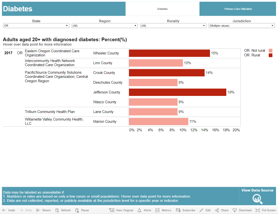
What we notice: Jefferson County has the highest rate (18%) of adults (age 20+) with diagnosed diabetes. We will need to do some more research by exploring additional subtopics and indicators on the Diabetes Dashboard.
What’s next: We will examine the available data related to access to care to better understand options for addressing Jefferson County’s rate of diagnosed diabetes. Specifically, we’ll explore data related to testing and utilization of care.
3. Select the Primary Care Utilization subtopic on the Diabetes Dashboard.
4. Filter using the following information:
Indicator: Medicare enrollees with diabetes who received HbA1c testing: Rate
State: OR
Region: All
Rurality: All
Jurisdiction: Crook, Deschutes, Jefferson, Lane, Linn, Marion, Wasco, Wheeler
We chose this indicator because it is one of the most important tests for people with diabetes and helps identify risk for diabetes-related complications.
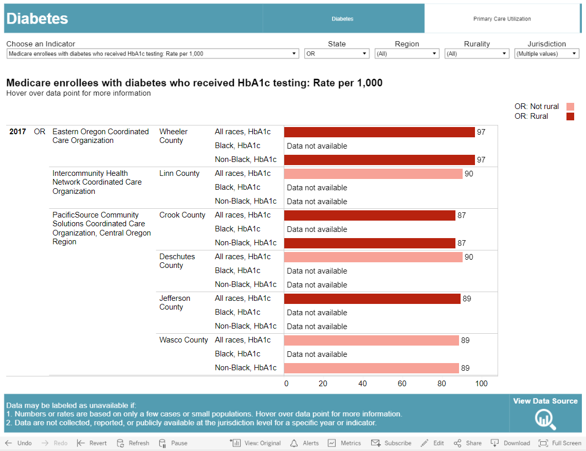
What we notice: Jefferson County is about average (89 tests per 1,000 people for all races) compared to neighboring counties.
What it could mean: HbA1c testing in Jefferson County is being done roughly as often as in other jurisdictions so diabetes care in Jefferson County for Medicare enrollees is average compared to neighboring counties.
What’s next: We will examine other testing and utilization of care.
5. Stay in the Primary Care Utilization subtopic, but select a new indicator to help gain additional insight. This time we chose the Medicare enrollees with diabetes who received blood lipids testing: Rate indicator, because people with diabetes are more likely to develop heart disease.

What we notice: Jefferson County has the lowest rate (58 tests per 1,000 people for all races) compared to neighboring counties.
What it could mean: Blood lipids testing is comparatively low in Jefferson County, so people with diabetes are not receiving care that is as comprehensive as the care people in neighboring counties receive.
What’s next: We will examine utilization of care as a potential factor.
6. Stay in the Primary Care Utilization subtopic, but select a new indicator to help gain additional insight. This time we chose the Medicare enrollees with diabetes who received eye exam: Rate indicator, because diabetes increases the risk of developing glaucoma and cataracts.
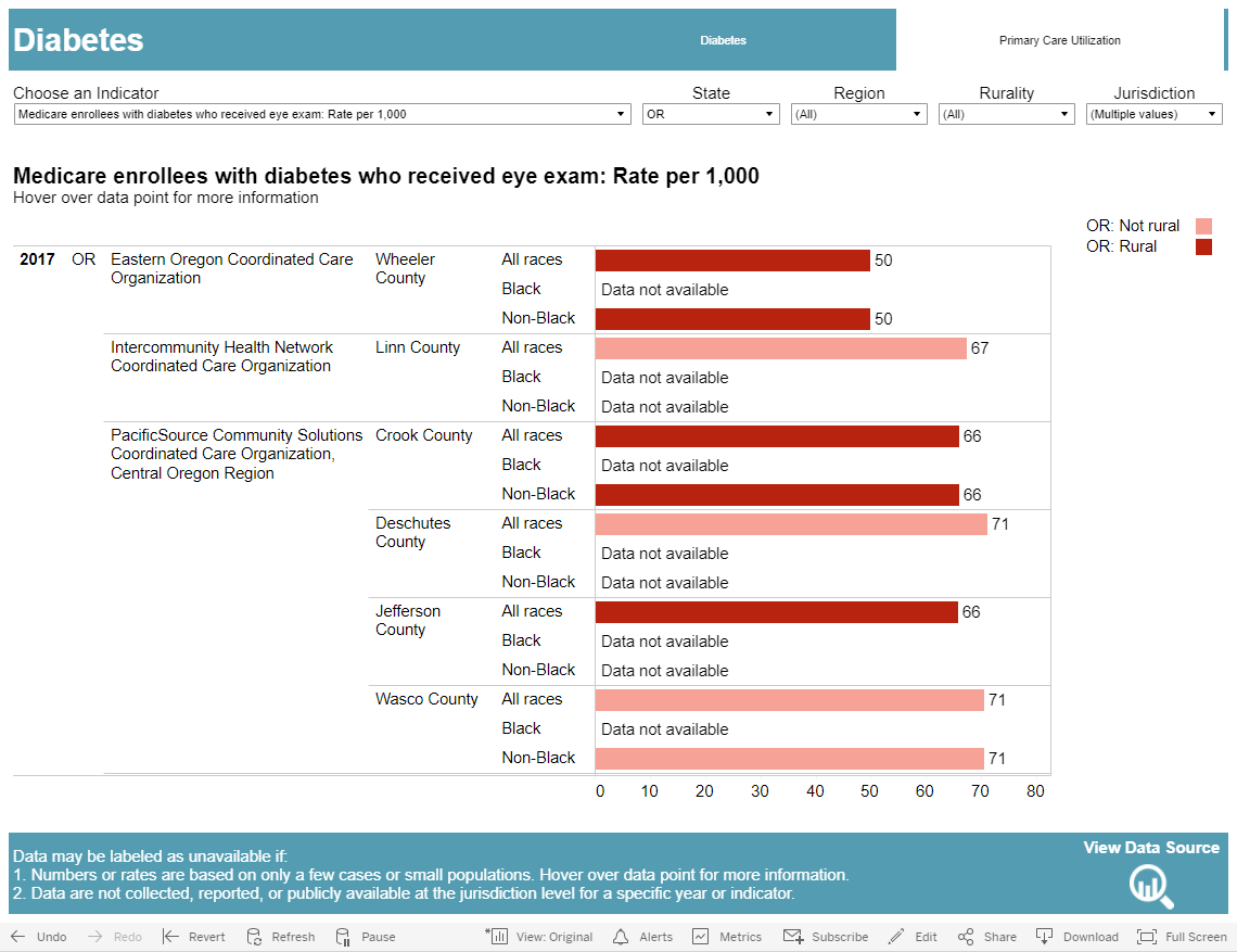
What we notice: Jefferson County has the second lowest rate (66 exams per 1,000 people for all races) compared to neighboring counties.
What it could mean: Based on all the data we have seen so far (higher diagnosis rates, average to lower rates for key tests, and lower eye exam rates than neighboring counties), the residents of Jefferson County are likely not getting enough diabetes care despite having a higher than average need. This points to the need for further probing to examine potential health disparities related to diabetes. It is important to note that these indicators are only for Medicare enrollees with diabetes and not for the entire population.
What’s next: We’d like to examine factors that could help identify any disparities in diabetes care in Jefferson County. These could be things like the population makeup or socioeconomic status. This data can be found in the Demographics Dashboard.
7. Navigate to the Demographics Dashboard and select the Personal Characteristics subtopic.
8. Filter using the following information:
Indicator: Race: Percent (%)
State: OR
Region: All
Jurisdiction: Crook, Deschutes, Jefferson, Lane, Linn, Marion, Wasco, Wheeler
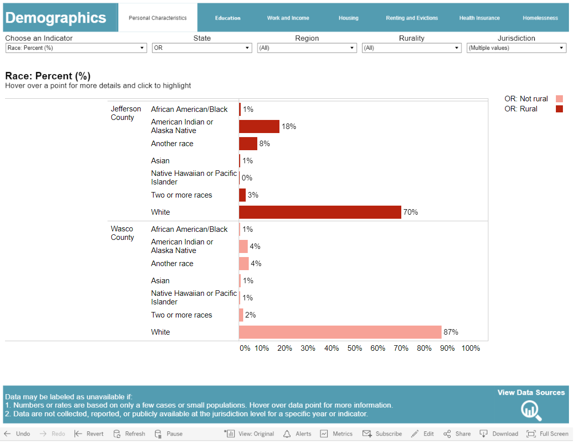
What we notice: Jefferson County has the largest population of American Indians and Alaska Natives (AIAN) compared to neighboring counties.
What it could mean: After reading information from the CDC that AIANs have a greater chance of having diabetes than any other US racial group, you might wonder if this could be related to the higher rate of overall diabetes in Jefferson County. Ideally, you’d find information on the rate of diabetes broken down by racial groups. However, we do not know the rate of adult diabetes in the AIAN Jefferson County population based on the data dashboards. Knowing Jefferson County has a larger AIAN population might be a factor in explaining the high rate of adult diabetes though. More data on diabetes by racial groups needs to be collected to investigate this. When examining demographic data, it is important to remember that factors related to systemic racism and oppression cause health disparities. It is historical oppression, not race or genetics, that causes disparities.
What’s next: Some research shows that the odds of having diabetes are greater for people who have less than a high school education, so we will take a closer look at available education data.
9. Select the Education subtopic of the Demographics Dashboard.
Indicator: Population aged 16-19 not enrolled, not graduated: Percent (%)
State: OR
Region: All
Jurisdiction: Crook, Deschutes, Jefferson, Lane, Linn, Marion, Wasco, Wheeler
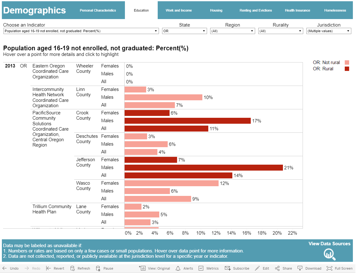
What we notice: Jefferson County has the highest rate of males who leave high school before graduating (21%).
What’s next: Education can have an effect on employment, so we want to also explore that data for Jefferson County.
10. Select the Work and Income subtopic of the Demographics Dashboard.
Indicator: Civilian population aged 16+ who are unemployed: Percent(%)
State: OR
Region: All
Jurisdiction: Crook, Deschutes, Jefferson, Lane, Linn, Marion, Wasco, Wheeler
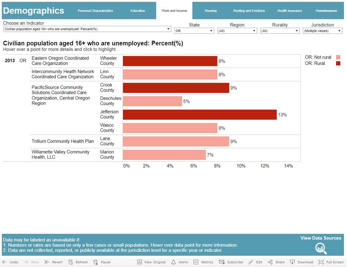
What we notice: Jefferson County has the highest unemployment rate (13%) with Crook and Lane Counties being the second highest (9%).
What this could mean: Our data on education and employment seems to reinforce what the research indicates are risk factors for development of diabetes. Research shows that people with lower educational attainment are less likely to have stable, full-time jobs that provide insurance. Because of this, they might be unable to receive comprehensive diabetes care. Without comprehensive care, someone might develop a diabetes-related disability that doesn’t allow them to work.
Overall Conclusion: The data dashboard provided a quick snapshot into some good areas to further examine in order to better understand potential diabetes health disparities in Oregon. Please remember to be careful in drawing any definite conclusions from the available data on the dashboard. You saw in our examination of race in Jefferson County that there is no county-level data for diabetes rates by race in Oregon. Similarly, while there are links between diabetes rates and socioeconomic factors like education level and unemployment, these could be related to long standing policy or structural conditions not explained by the data.
Remember that the demographic characteristics are not the cause of the disparities; policy mechanisms and institutional factors are. Those factors need to be investigated to truly understand and address disparities. More high quality data is needed to investigate this. For this scenario, other data to examine is age, disability status, comorbidities, and/or health insurance status.
Public health professionals should continue to explore data as shown above until they gain experience in a crucial part of the process of making data-driven decisions.
Learn more about data and health equity from curated trainings and webinars on this site.